
- Navigation Bar: Clicking on the Back arrow or the Module Title will take you into the Module View. Clicking on Modules will take you to the Home Page (with the Modules tab selected).
- Settings Button: Opens the Module settings context menu
- Preview Button: Opens a live preview of the current deck in a new tab in the browser. Note that if the preview window is already open, it will refresh with your updates, but you will need to click the browser tab to view it.
- Deck Panel: Displays the cards in the current deck. Click a card to select it and edit its contents. Drag the card to change its position in the deck sequence.
- New Card Button: Adds a new card to the current deck.
- Edit Practice Link: Opens the Practice Editor for the current deck.
- Image Library Button: Selecting this button will display a sortable, filterable list of your images in this panel.
- Card Library Button: Selecting this option will display a list of cards from other decks in the module.
- Library Card: You can copy a card from another deck in the module by dragging it from here into the Deck Panel on the left(4).
- Delete Card Button: You can delete unused cards from the Card Library panel by clicking on the trash can icon. Note that if this card is currently being used in any other deck or module, you will not be able to delete it.
- Deck Intro Button: Clicking this button enables you to add an optional intro to the deck. The content will appear to the learner as a pop-up window when they first launch the learn deck. If you have already created an intro (as in the example above), you can edit its contents by clicking here.
- Card Selector: Click a card in the Deck Panel view selects that card for editing (see below). Holding it down and dragging it allows you to move it up or down in the sequence of cards in the deck.
The Card Editor
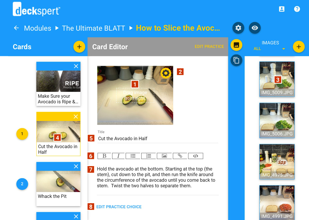
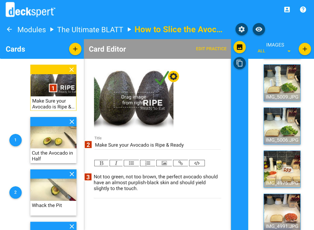
- Image Drop Area: Drag an image from the Image Library on the right (select the Image Button to access it, 7 on the previous diagram) into this area to add or change the card picture.
- Image Settings Button: Clicking this button opens the Image Control panel. Click here for more details on this panel.
- Image Tile: Drag the image tile onto the Image Drop Area (1) to replace the current image with a new one.
- Deck Card: Click the card you want to edit to display the contents in the work area.
- Title Field: Enter a short title or label into this field. This text will be displayed in bold on both the card view and the slideshow view. The text entered here also supplies the default label for the associated practice/challenge option (see 8).
- Text Controls: This control bar allows you style the body text (Bold, Italic), to add a numbered list or bullet list, to insert an image or hyperlink, and to view/edit the HTML formatting for the text field. [NOTE: To insert an image into the body text (generally not recommended), you can use an absolute link to an external site (e.g. “http://www.mydomain.com/images/[filename]”) or use (“assets/[filename]”) to reference an image manually placed in the assets folder of an exported package.]
- Main Text Field: Enter the main descriptive text for the card here. Use the controls described above to style and format your text.
- Practice Choice Link: Clicking here will display the Option that is automatically associated with this card in the practice and challenge modes. You can edit the option label directly in this view, or you can click the Edit Practice link to view and edit the option along with the others for the current deck.
The Intro Editor
The Deck Intro Editor is identical in every respect to the Card Editor, only with fewer features.
- Intro Button: Select this button to add an intro or edit its contents
- Intro Title: Add a title to the Intro Card here.
- Intro Body: Add the intro text here.